plots_alcohol_use
plots_alcohol_use.RmdIntroduction
Having reviewed the fundamental principles of data visualization,
including the best practices and pitfalls to avoid, we will now delve
into practical applications. This segment of the workshop will employ
real-world examples, demonstrating how to create impactful and effective
visualizations using code.
We’ll specifically focus on utilizing the ggplot2 package within R, a
powerful tool for crafting clear and informative graphical
representations of data.
To begin, we will load the necessary libraries for our data analysis and visualization tasks. Our dataset is housed within the ‘RiskExplorer’ package, which we will access first. Additionally, we will utilize the ‘dplyr’ and ‘ggplot2’ packages.
library(RiskExplorer)
library(dplyr)
#> Warning: package 'dplyr' was built under R version 4.3.1
#>
#> Attaching package: 'dplyr'
#> The following objects are masked from 'package:stats':
#>
#>     filter, lag
#> The following objects are masked from 'package:base':
#>
#>     intersect, setdiff, setequal, union
library(ggplot2)
#> Warning: package 'ggplot2' was built under R version 4.3.1
Now that we have loaded our packages, the next step is to bring in the data we are interested in analyzing.
Our main focus is to explore patterns of alcohol use among adolescents from 2017 to 2021. To achieve this, we will use the Youth Risk Behavior Surveillance System (YRBSS) dataset. The following chunk of code will load this dataset into our R environment, preparing us for the subsequent analysis
data("youthAlcoholUse")Before diving into our specific analysis, it’s crucial to first conduct a preliminary exploration of the dataset. To facilitate this, we will use a function that generates a comprehensive and easily interpretable table. This table will display the various variables available in our dataset, providing us with a clear overview and aiding in our understanding of the data at hand.
youthAlcoholUse |>
gtExtras::gt_plt_summary()| youthAlcoholUse | ||||||
| 3385 rows x 12 cols | ||||||
| Column | Plot Overview | Missing | Mean | Median | SD | |
|---|---|---|---|---|---|---|
Year2017, 2019 and 2021 |
0.0% | — | — | — | ||
| Age | 0.8% | 16.5 | 17.0 | 1.2 | ||
SexFemale and Male |
1.1% | — | — | — | ||
Grade12, 11, 10 and 9 |
1.2% | — | — | — | ||
RaceWhite, Multiple-Hispanic, Hispanic/Latino, Black or African American, Multiple-Non-Hispanic, Asian, Am Indian/Alaska Native and Native Hawaiian/Other PI |
1.6% | — | — | — | ||
SexOrientationHeterosexual, Bisexual, Not sure and Gay or Lesbian |
6.3% | — | — | — | ||
| TimesPhysicalFight | 1.6% | 1.4 | 0.0 | 2.8 | ||
| AgeFirstAlcohol | 0.0% | 12.7 | 13.0 | 2.5 | ||
| HowManyDaysAlcoholInMonth | 0.0% | 8.1 | 5.0 | 7.6 | ||
SourceAlcohol6, 5, 8, 7, 2, 3 and 4 |
4.2% | — | — | — | ||
| DaysOfBingeDrinking | 0.0% | 4.5 | 2.0 | 5.1 | ||
| LargestNumberOfDrinks | 0.0% | 7.1 | 7.0 | 2.2 | ||
Now that we understand the dataset, we have chosen to focus on a key variable: the quantity of alcoholic drinks consumed by adolescents in a month.
Before we proceed to the visualization, let’s think: What would be the most effective way to represent this data? Consider what variables might be best suited for the x-axis and the y-axis.
With this in mind, let’s begin with the simplest plot. This approach will allow us to understand the basic trends within our data:
Oh, but wait a minute, cefore we proceed, it’s important to note that our analysis requires us to first compute a single representative value for each year in our dataset. The ‘tidyverse’ metapackage, offers us the tools needed for this task. Specifically, we can use a function to summarize our data by a chosen variable—in our case, the year. This function enables us to calculate a measure of central tendency for our data. For this analysis, we have decided to compute the mean number of drinks consumed per year
youthAlcoholUse |>
  summarise(mean = mean(HowManyDaysAlcoholInMonth), .by = c(Year)) |>
  ggplot(aes(x = Year, y = mean)) +
  geom_bar(stat = "identity")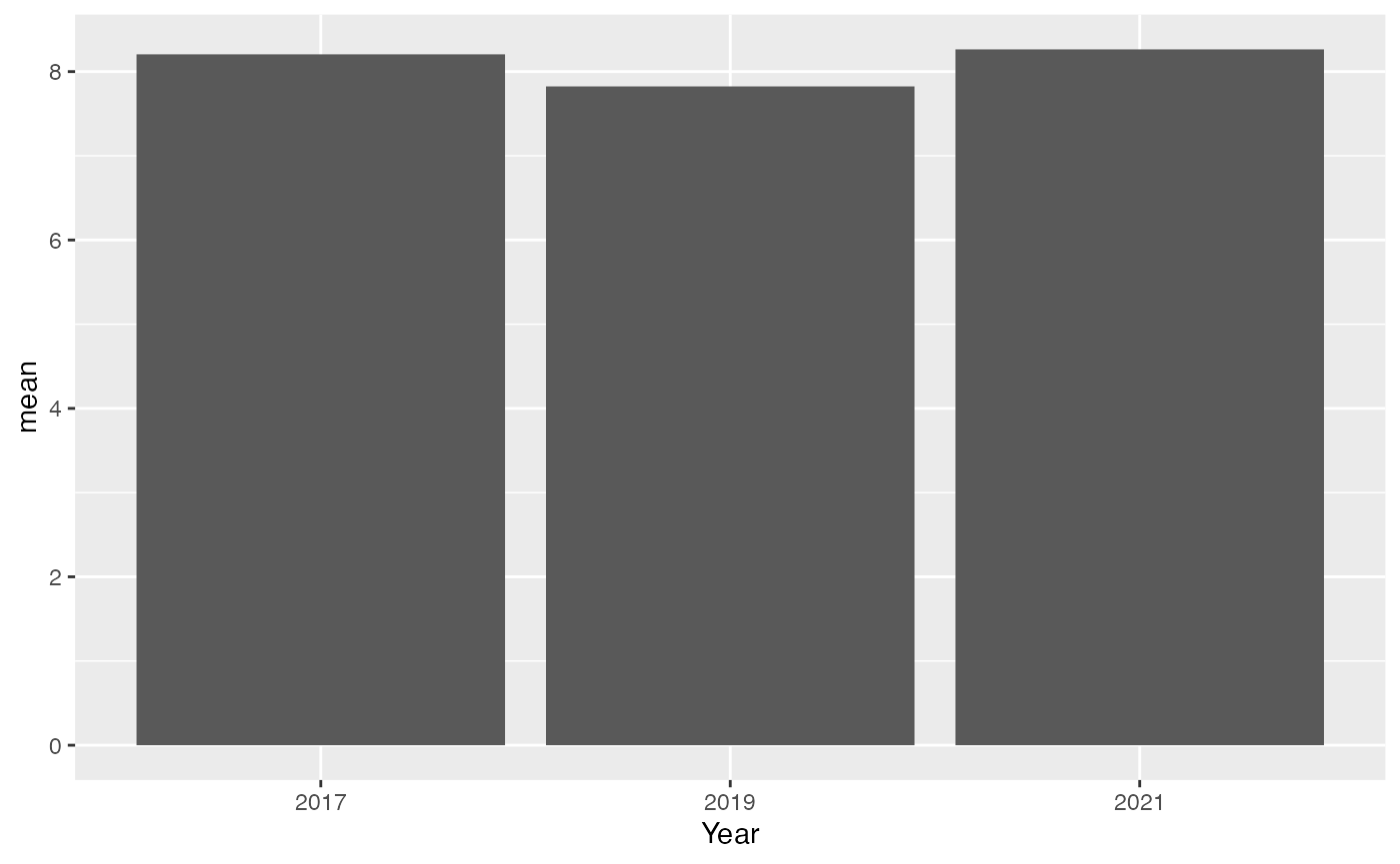
This graph shows the number of drinks per month for adolescents is pretty much the same each year, with a small dip in 2019 and then back up in 2021. It looks stable, but we expected an increase. Maybe the trends are different for boys and girls? Let’s check by splitting the data by sex and see what that tells us
Remember how we grouped our data by year? Now, we’re going to group it by sex as well. We just add ‘sex’ as another variable in our summarize function
youthAlcoholUse |>
  summarise(mean = mean(HowManyDaysAlcoholInMonth), .by = c(Year, Sex)) |>
  filter(!is.na(Sex)) |>
  ggplot(aes(x = Year, y = mean, fill = Sex, group = Sex)) +
  geom_bar(stat = "identity")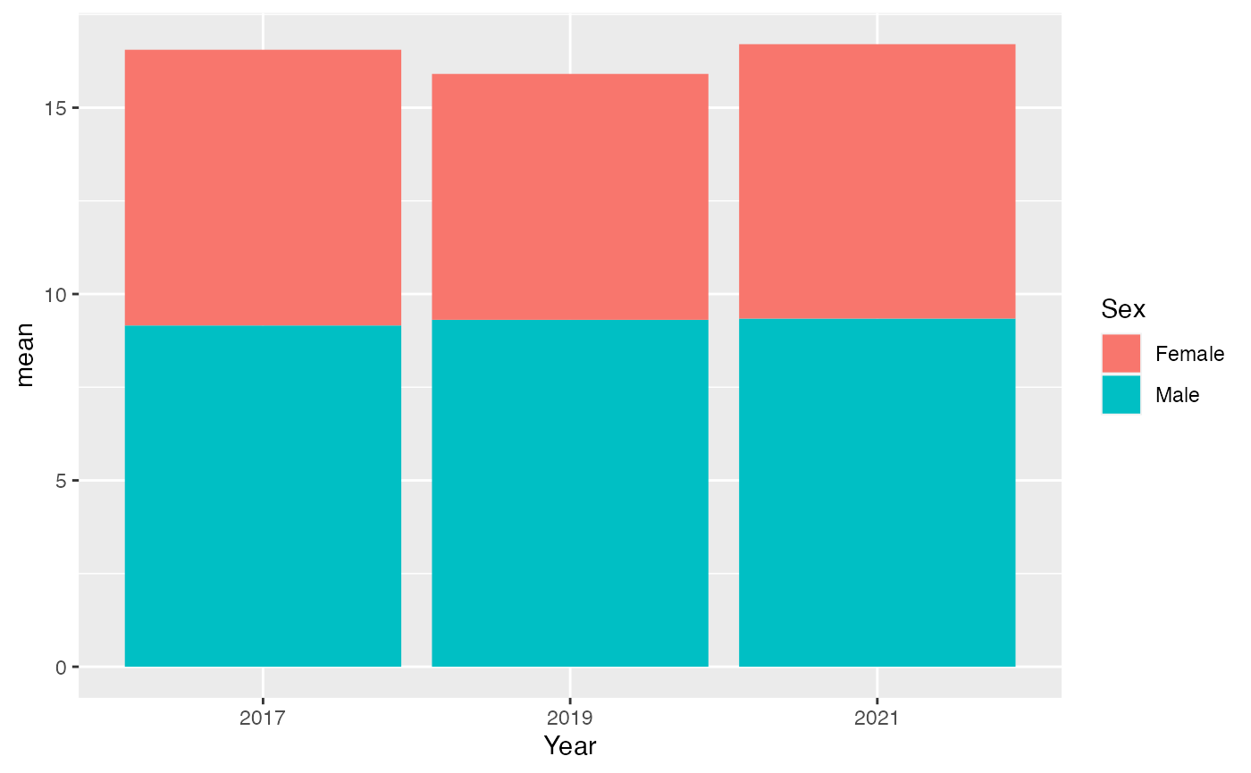
Oops, we forgot our own advice about avoiding hard-to-read graphs. This stacked graph is a bit tricky, but it shows that boys’ drinking habits haven’t changed much over the years. Girls, on the other hand, show a noticeable change, especially in 2019. We can definitely create a clearer graph to understand this better.
youthAlcoholUse |>
  summarise(mean = mean(HowManyDaysAlcoholInMonth), .by = c(Year, Sex)) |>
  filter(!is.na(Sex)) |>
  ggplot(aes(x = Year, y = mean, fill = Sex, group = Sex)) +
  geom_bar(stat = "identity", position = "dodge")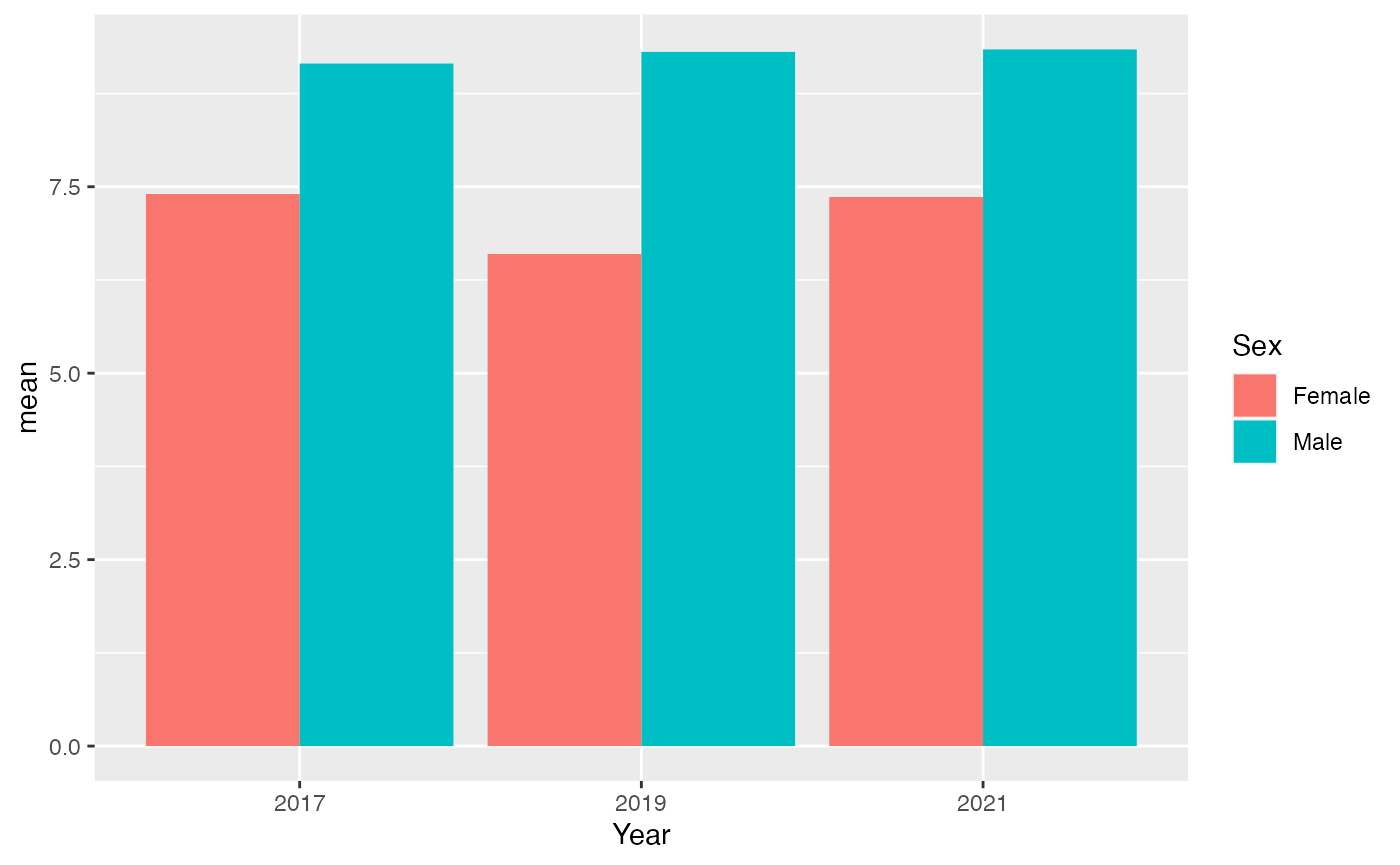
By placing boys and girls side by side in our graph, we gain new insights. It’s now evident that boys generally consume more drinks than girls. As for the trends, they stay consistent: boys’ drinking patterns are stable, while there’s some variation for girls.
Can we make the trend easier to see? Instead of bars, let’s use points. We’ll save ink and make our graph clearer. Let’s try this new approach
youthAlcoholUse |>
  summarise(mean = mean(HowManyDaysAlcoholInMonth), .by = c(Year, Sex)) |>
  filter(!is.na(Sex)) |>
  ggplot(aes(x = Year, y = mean, color = Sex, group = Sex)) +
geom_point() 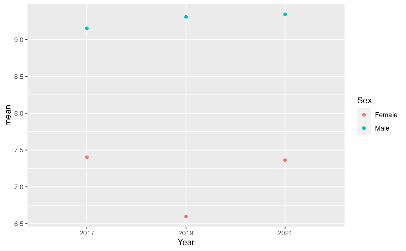
Switching to points reveals something new: boys’ drinking is actually increasing over time, and there’s a big gap between boys and girls. It looks like girls’ drinking is decreasing.
Let’s connect the dots to make the trend clearer. This should help us see the changes over time more easily.
youthAlcoholUse |>
  summarise(mean = mean(HowManyDaysAlcoholInMonth), .by = c(Year, Sex)) |>
  filter(!is.na(Sex)) |>
  ggplot(aes(x = Year, y = mean, color = Sex, group = Sex)) +
  geom_point() +
  geom_line()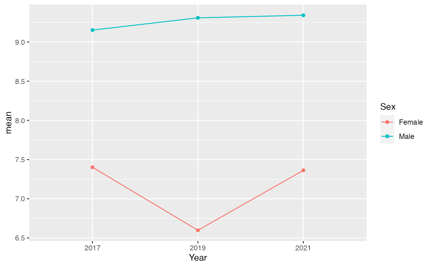
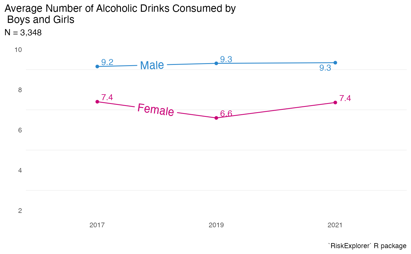
We’ve made good progress with our graph. It now effectively shows the different trends for males and females. But to make it publication-ready, let’s add a few final touches:
- A clear title.
- The data source.
- Continue to save ink for clarity.
These improvements will ensure our graph can stand on its own and be publication ready .
library(ggrepel)
#> Warning: package 'ggrepel' was built under R version 4.3.1
library(geomtextpath)

youthAlcoholUse |>
  summarise(mean = mean(HowManyDaysAlcoholInMonth), .by = c(Year, Sex)) |>
  filter(!is.na(Sex)) |>
  ggplot(aes(x = Year, y = mean, color = Sex, group = Sex)) +
  geom_point() +
  labs(
    x = "",
    y = "",
    title = "Average Number of Alcoholic Drinks Consumed by \n Boys and Girls",
    subtitle = "N = 3,348",
    caption = "`RiskExplorer` R package"
  ) +
  theme_minimal() +
  scale_color_manual(values = c(Female = "#c90076", Male = "#2986cc")) +
  geom_text_repel(aes(label = round(mean, 1))) +
  geom_textline(aes(label = Sex), size = 5, hjust = 0.2) +
  theme(
    legend.position = "none",
    panel.grid.major = element_blank(),
    plot.title.position = "plot"
  ) +
  scale_y_continuous(limits = c(2, 10))